
The modern world relies heavily on data. Whether one has to present sales, budget, performance, or overall health of an organisation in a meeting, data is the key to measuring and presenting every matrix.
In other words, we can say that data is the oil of the modern digital world.
As per a study given by Statista, almost 90% of the world’s data was generated in the last two years only. In fact, just in the year 2024, the world has generated 149 zettabytes of data, which is more than 74x when compared to 2 zettabytes of data generated in 2010.
The question is, how can we easily make sense of this humongous amount of data? Is there any way that can help us to understand and gain critical insight from these data in a simple way?
Well, that is where data visualization methods come into play.
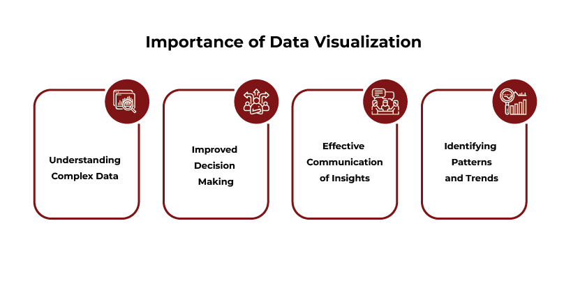
These methods transform cluttered data into interactive visuals such as graphs, charts, and maps that are simple to comprehend. Each sector, ranging from healthcare to education, depends on these methods in order to make more effective decisions.
Without these data visualization techniques, insights will get lost in an ocean of numbers. Selecting the best method assures data storytelling is effective, emphasizes salient points, and saves time.
What is Data Visualization Techniques?
In easy terms, data visualization techniques are procedures that convert data into simple and attention-grabbing visual forms. These encompass graphs, diagrams, and dashboards that provide simplicity to complicated data sets
The objective is to make patterns, trends, and associations easy to identify.
The value of these techniques is in their capability to:
- Turn complicated data into consumable visuals.
- Identify trends rapidly, e.g., dips in sales or spikes in performance.
- Communicate insights effectively to non-technical audiences, like stakeholders.

POSTGRADUATE PROGRAM IN
Data Science & AIML
Learn Data Science, AI & ML to turn raw data into powerful, predictive insights.
What are the Different Types of Data Visualization Techniques?
We can categorise different types of data visualization techniques into 5 broader groups:
1. Charts and Graphs
These are the foundation of techniques for data visualization and are perfect for comparisons, trends, and distributions.
- Bar Charts
- Funnel Charts
- Highlight Tables
- Bullet Graphs
- Line Graphs
- Area Charts
- Pie Charts
- Histograms
- Scatter Plots
- Pictogram Charts
2. Maps
Geographical data is best represented visually to highlight spatial relationships.
- Choropleth Maps
- Heatmaps
- Dot Distribution Maps
- Cartograms
3. Hierarchical and Part-to-Whole Visualizations
For data with layers or breakdowns, these techniques offer clarity.
- Tree Maps
- Sunburst Charts
- Radical Wheels
- Gantt Charts
- Venn Diagrams
4. Text-Based and Analytical Visualizations
Data doesn’t always have to be numbers. Textual data also benefits from visualisation.
- Word Clouds
- Timelines
- Mind Maps
- Flowcharts
- PERT Charts
5. Advanced and Multidimensional Techniques
For analysing multiple variables or large datasets, these techniques work best.
- Waterfall Charts
- Bubble Charts
- Box-and-Whisker Plots
- Network Diagrams
- Correlation Matrices
- 3D Plots
Also Read: Data Visualization in Data Science: Bringing Data to Life
Charts and Graphs: The Most Common Data Visualization Techniques
Charts and graphs are often the first tools that come to mind when we think of data visualisation. They’re simple, effective, and versatile. These effective data storytelling techniques simplify comparisons and highlight trends.
Bar Charts
Bar charts are one of the most popular tools for comparing data.
They compare categories of data, making them an essential tool in business and analytics. They display categories along one axis and values on the other, using bars to represent the numbers.
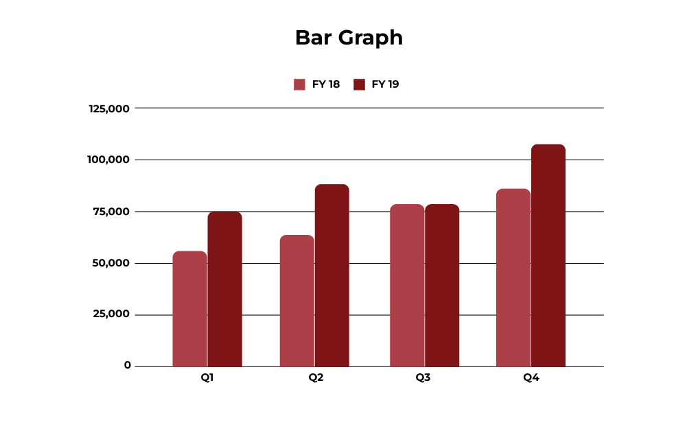
Use Cases:
- Comparing smartphone sales across Indian states like Gujarat, Karnataka, and Punjab.
- Tracking monthly website traffic for an e-commerce platform.
- Showing the distribution of vaccination rates across urban and rural areas.
- Analysing the revenue contributions of different product categories in retail.
- Comparing customer satisfaction levels across regions.
Funnel Charts
Funnel charts represent processes or workflows with multiple stages, narrowing as they progress. They are especially effective for identifying drop-offs or bottlenecks in a process.

Use Cases:
- Analysing the sales funnel, from leads generated to deals closed.
- Tracking recruitment processes, starting from applications received to candidates hired.
- Showing website conversion rates, from visitors to purchases.
- Visualising customer support workflows, from tickets raised to issues resolved.
- Monitoring patient care stages in a hospital, from diagnosis to discharge.
Highlight Tables
Highlight tables are essentially data tables enhanced with colour coding. The colours help emphasise trends, patterns, or critical data points, making them easier to spot.
Use Cases:
- Visualising student performance across subjects, with colour intensity showing high or low scores.
- Showing sales performance of regions in India, such as Maharashtra, West Bengal, and Kerala.
- Analysing monthly electricity consumption across cities, highlighting higher usage.
- Comparing profitability across multiple departments, with losses highlighted in red.
- Representing customer satisfaction levels, with shades indicating different ratings.
Bullet Graphs
Bullet graphs are compact, efficient charts that compare performance against a target. They consist of a bar representing actual performance and markers showing targets or benchmarks.
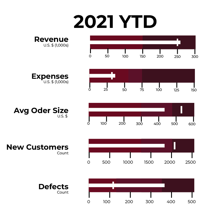
Use Cases:
- Tracking monthly sales performance for a team against their assigned targets.
- Measuring progress toward revenue goals for a specific quarter.
- Analysing employee productivity levels compared to company benchmarks.
- Representing the percentage of completion for a construction project against the original timeline.
- Comparing budget allocations versus actual spending across multiple departments.
Line Graphs
Line graphs are perfect for showing trends and changes over time, helping us identify patterns at a glance.
They show data points connected by lines, making it easy to spot trends or fluctuations.
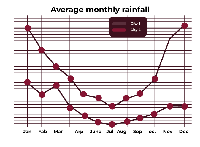
Use Cases:
- Analysing temperature changes throughout the year in different Indian cities.
- Tracking the number of active users on an app over the last 12 months.
- Monitoring stock market performance for a company like Infosys.
- Comparing the growth rate of GDP across South Asian countries.
- Displaying a product’s sales performance during festive seasons.
Area Charts
Area charts are similar to line graphs but fill the area below the line with colour. They are excellent for showing trends and comparisons over time, especially when focusing on cumulative data.
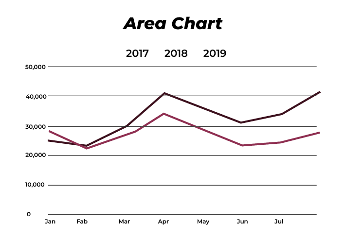
Use Cases:
- Visualising a company’s revenue growth over multiple years.
- Comparing the total sales of two or more products across months or quarters.
- Showing the energy production from different sources (e.g., solar, wind, and hydro) over a year.
- Analysing website traffic contributions from various channels like organic search, social media, and paid ads.
- Tracking rainfall data over months in different regions of India.
Pie Charts
When you want to show proportions within a whole, pie charts are the go-to. Each segment represents a percentage, making them ideal for visualising distribution.
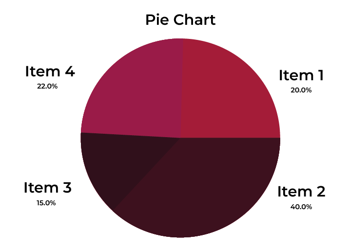
Use Cases:
- Visualising the distribution of government spending in areas like education, defence, and healthcare.
- Showing the percentage of votes gained by political parties in state elections.
- Representing a company’s expense breakdown (e.g., 40% marketing, 30% salaries).
- Highlighting the share of renewable energy sources in total power production.
- Displaying customer feedback categories like positive, neutral, and negative.
Histograms
Histograms are essential when we need to display frequency distributions. They group data into intervals, helping us see how data is spread across intervals.
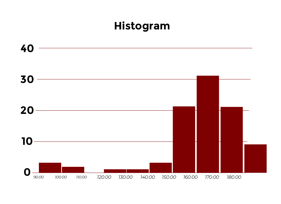
Use Cases:
- Showing exam score ranges for students (e.g., how many scored 0–20, 20–40, etc.).
- Analysing the time users spend on a streaming platform.
- Tracking rainfall distribution across various Indian districts.
- Displaying the age demographics of a population in a survey.
- Examining electricity usage ranges across households in a city.
Scatter Plots
Scatter plots highlight relationships or correlations between two variables by plotting individual data points. Each dot on the graph represents a data point, showing how the two variables interact.
Use Cases:
- Comparing ad spend versus sales revenue for marketing campaigns.
- Analysing the relationship between a vehicle’s weight and its fuel efficiency.
- Tracking the impact of tuition fees on student enrolment rates.
- Comparing hours studied with exam performance in schools.
- Understanding the connection between urbanisation and water consumption levels.
Pictogram Charts
Pictogram charts use icons or symbols to represent data. Each icon corresponds to a specific value, making these charts visually engaging and easy to interpret.
Use Cases:
- Displaying survey results, such as the percentage of people preferring certain products or services.
- Representing literacy rates using icons of books or students from different states in India.
- Showing gender distribution in a company using male and female icons.
- Visualising market share, with icons representing the number of units sold by different brands.
- Highlighting resource usage, such as the percentage of renewable versus non-renewable energy sources.
Also Read: Power BI vs. Tableau: Choosing the Right Data Visualization Tool
Maps: Presenting Geographical Data
When location matters, maps are the best tools for visualising data. They make it easier to understand spatial patterns, regional trends, and geographical insights.
Choropleth Maps
Choropleth maps use shading or colour gradients to represent data values across regions. Darker shades often indicate higher values, while lighter ones represent lower values.
Use Cases:
- Displaying literacy rates across Indian states, with darker shades for higher rates.
- Visualising COVID-19 vaccination coverage across districts.
- Mapping state-wise industrial output in India.
- Highlighting poverty rates across various regions of the country.
- Representing the level of internet penetration in rural and urban areas.
Heatmaps
Heatmaps use colour gradients to represent intensity, helping us identify patterns or hotspots.
Use Cases:
- Showing sales density by pin code in major cities like Delhi or Mumbai.
- Analysing cricket match scores by over to spot high-scoring periods.
- Highlighting accident-prone zones on highways.
- Visualising the busiest times on a metro network.
- Tracking footfall intensity in shopping malls during festivals.
Dot Distribution Maps
Dot maps place dots on a map to show data distribution. The concentration of dots indicates density or frequency.
Use Cases:
- Showing population density in metropolitan cities like Chennai and Bengaluru.
- Mapping agricultural production across districts (e.g., rice in Punjab, wheat in Haryana).
- Representing voter turnout by polling booth locations.
- Displaying the location of renewable energy plants (solar, wind) across India.
- Tracking wildlife sightings in national parks.
Cartograms
Cartograms resize geographic areas based on data values rather than their physical size.
Use Cases:
- Resizing Indian states based on their GDP contributions, making Maharashtra appear larger.
- Adjusting city sizes to reflect population density.
- Highlighting state-wise electricity consumption by distorting map proportions.
- Showing healthcare infrastructure capacity (hospitals and clinics) by region.
- Mapping water resource availability by district size.

82.9%
of professionals don't believe their degree can help them get ahead at work.
Hierarchical and Part-to-Whole Data Visualization Techniques
When you work with data that involves categories, subcategories, or proportions, hierarchical and part-to-whole visualisations make it easy to see relationships and structure.
Tree Maps
Tree maps are ideal for showing proportions within a hierarchy. They use rectangles, with each rectangle representing a category or subcategory. The size of the rectangle shows the proportion of the data it represents.
Use Cases:
- Visualising market share by product lines in a company.
- Analysing state-wise revenue contributions in India, such as Maharashtra, Gujarat, and Tamil Nadu.
- Mapping budget allocations across departments like education, healthcare, and infrastructure.
- Showing software usage statistics by industry sectors.
- Breaking down costs for a large project to identify the most significant expenses.
Sunburst Charts
Sunburst charts expand on tree maps by showing hierarchical data in circular layers. Each layer represents a level in the hierarchy, starting from the centre.
Use Cases:
- Mapping an organisation’s structure, from top-level management to individual teams.
- Visualising population distribution across continents, countries, and cities.
- Tracking revenue streams for a business, from primary products to subcategories.
- Representing website navigation paths to understand user behaviour.
- Showing product sales data segmented by regions and customer types.
Radial Wheels
Radial wheels arrange categories around a circle to display their relationships. They are helpful for visually organising information with multiple dimensions.
Use Cases:
- Highlighting employee skill ratings across different parameters like communication, technical expertise, and teamwork.
- Showing relationships between departments in a company and their collaborative roles.
- Representing product feature comparisons for decision-making in procurement.
- Visualising the allocation of tasks in a large project among team members.
- Analysing consumer preferences for multiple product attributes in surveys.
Gantt Charts
Gantt charts are indispensable tools for project management. They visually map out tasks over a timeline, showing dependencies, progress, and deadlines.
Use Cases:
- Planning construction projects with timelines for each phase (e.g., foundation, roofing, and interior work).
- Scheduling software development activities, like coding, testing, and deployment.
- Tracking tasks for event planning, such as vendor management and guest coordination.
- Visualising academic project deadlines for students working on group assignments.
- Managing large-scale marketing campaigns with overlapping tasks like content creation, approvals, and launches.
Venn Diagrams
Venn diagrams use overlapping circles to highlight commonalities and differences between sets. They are best for showing shared attributes.
Use Cases:
- Comparing features of smartphones from brands like Xiaomi, Samsung, and Realme.
- Analysing overlaps in customer demographics for online and offline retail.
- Representing common skills required across various IT job roles.
- Highlighting similarities in sales trends for regions with shared customer behaviour.
- Identifying product features most valued by users in multiple market segments.
Text-Based Data Visualization Techniques: Simplifying Contextual Information
Not all data fits neatly into charts and graphs. Text-based visualisations offer clarity for qualitative data, timelines, and workflows.
Word Clouds
Word clouds visualise text data by making frequently used words larger and more prominent. They’re great for uncovering themes.
Use Cases:
- Summarising customer reviews for an e-commerce platform.
- Analysing election speeches to identify key topics discussed by political parties.
- Highlighting common issues raised in employee feedback surveys.
- Showing trending topics in social media discussions across India.
- Extracting themes from academic research papers for literature reviews.
Timelines
Timelines display events in chronological order, making them useful for tracking progress or understanding historical context.
Use Cases:
- Highlighting key milestones in a company’s growth, such as acquisitions and product launches.
- Creating a project timeline for construction work with critical deadlines.
- Showing a historical timeline of major scientific discoveries.
- Mapping the development phases of a software product.
- Representing the progress of policy implementations across states.
Mind Maps
Mind maps visually organise ideas and relationships. They’re useful for brainstorming, planning, and simplifying complex concepts.
Use Cases:
- Outlining the structure of an annual business report.
- Planning marketing campaigns, from goals to channel strategies.
- Breaking down curriculum topics for teachers in educational institutions.
- Organising customer journey steps in e-commerce.
- Brainstorming product features for a mobile app design.
Flowcharts
Flowcharts use symbols and arrows to show processes step-by-step. They’re widely used for workflows and decision-making.
Use Cases:
- Visualising the customer onboarding process for a banking service.
- Mapping manufacturing workflows in a factory.
- Showing troubleshooting steps for IT support teams.
- Outlining decision trees for loan approvals in finance.
- Designing user pathways for websites to improve navigation.
PERT Charts
PERT charts (Program Evaluation and Review Technique) help with project planning by showing tasks, dependencies, and timelines.
Use Cases:
- Managing large-scale projects like software development with multiple teams.
- Planning the launch of a new product, from ideation to execution.
- Scheduling construction work for infrastructure projects.
- Coordinating academic research timelines for university students.
- Tracking delivery timelines for supply chain logistics.
Advanced and Multidimensional Data Visualization Techniques for Complex Insights
Some datasets demand deeper exploration. Advanced visualisations offer multidimensional perspectives to handle complex data.
Waterfall Charts
Waterfall charts are used to show the cumulative impact of sequential positive and negative values. They are particularly useful for understanding how an initial value is affected by a series of changes.
Use Cases:
- Analysing the step-by-step breakdown of profit, such as revenue, costs, and taxes in financial reports.
- Tracking monthly budget changes for a project, showing expenses, savings, and reallocations.
- Visualising sales performance, starting with total leads and filtering down to closed deals.
- Showing operational improvements in manufacturing, such as productivity gains and losses.
- Breaking down changes in a company’s cash flow over time, highlighting inflows and outflows.
Bubble Charts
Bubble charts add size and colour dimensions to scatter plots, offering richer insights.
Use Cases:
- Analysing the relationship between GDP, population, and education levels across states.
- Representing company performance based on revenue, market share, and industry type.
- Comparing advertising spend, customer reach, and profit margins across campaigns.
- Mapping environmental data like CO2 emissions by country and population size.
- Tracking product profitability versus demand in retail sectors.
Box-and-Whisker Plots
Box-and-whisker plots summarise data distributions, highlighting medians, ranges, and outliers.
Use Cases:
- Comparing salary ranges for IT professionals in different cities.
- Analysing student test scores across schools to identify performance patterns.
- Visualising daily temperature ranges in a city over a year.
- Tracking campaign performance metrics like click-through rates across channels.
- Studying price ranges for real estate properties across neighbourhoods.
Network Diagrams
Network diagrams show relationships between entities, making them ideal for visualising connections.
Use Cases:
- Mapping social networks to identify influencers in a group.
- Analysing supply chain links between suppliers and distributors.
- Showing IT systems and their dependencies within an organisation.
- Tracking communication patterns within large project teams.
- Representing interconnections in neural networks for machine learning models.
Correlation Matrices
Correlation matrices visually display the strength and direction of relationships between variables.
Use Cases:
- Identifying correlations between marketing spending, sales, and customer retention.
- Analysing the relationship between weather patterns and crop yields in agriculture.
- Studying the impact of education levels on employment rates.
- Tracking connections between economic indicators like inflation and stock market trends.
- Comparing demographic data and purchasing behaviour in market research.
3D Plots
3D plots extend traditional graphs by adding depth, making them useful for visualising three variables.
Use Cases:
- Analysing sales trends across region, time, and product type.
- Mapping pollution levels across cities with dimensions for time and severity.
- Comparing population growth, literacy rates, and healthcare access in rural areas.
- Tracking operational efficiency across production lines, shifts, and units.
- Studying environmental data like temperature, humidity, and air quality index.
Role of Data Visualization Techniques in Data Mining
Data mining involves identifying patterns, anomalies, and trends in large datasets. Effective data visualization techniques bridge the gap between raw numbers and actionable insights.
Uncovering Patterns
Scatter plots and correlation matrices are powerful for identifying relationships.
For instance:
- A scatter plot can reveal the relationship between rainfall and crop yields in India.
- A correlation matrix shows how economic factors like inflation and unemployment are interrelated.
Detecting Anomalies
Outliers in data often go unnoticed without the right visualisation.
- Box-and-whisker plots highlight anomalies in salary distributions across industries.
- Heatmaps reveal underperforming regions in a national sales campaign.
Exploring Trends
Line charts and time series visualisations track trends over time.
For example:
- Analysing electricity consumption patterns during peak summer months.
- Monitoring daily COVID-19 case counts in different cities.
Practical Applications in India
- The Reserve Bank of India uses visualisations to track inflation trends.
- Educational departments analyse student dropout rates by region.
By using these techniques, we can transform raw datasets into insights that drive smarter decisions.
Tools and Platforms that Help Data Visualization Techniques in Data Mining
Even the best techniques need the right tools for implementation. Here’s an overview of popular platforms to make your data visualisation effective.
Beginner-Friendly Tools for Quick Visualisations
Tableau
- Known for its intuitive drag-and-drop interface.
- Use it to build interactive dashboards, such as tracking sales across Indian cities.
Power BI
- Integrates seamlessly with Microsoft tools.
- Ideal for creating real-time reports for business decision-making.
Datawrapper
- A simple tool for creating clean charts without coding.
- Great for journalists presenting election results or survey findings.
Canva
- Popular for creating visually appealing designs.
- Use it to create custom charts and infographics for presentations.
Coder-Friendly Tools for Customised Visualisation
Matplotlib and Seaborn
- Matplotlib offers basic visualisation capabilities.
- Seaborn builds on Matplotlib for statistical plots, like correlation heatmaps.
Plotly
- Known for its interactive and animated plots.
- Great for creating 3D scatter plots or interactive choropleth maps.
Advanced Platforms for Real-Time and Complex Dashboards
Grafana
- Perfect for monitoring real-time metrics.
- Used in IT for tracking server performance or uptime statistics.
Kibana
- Works well for visualising log data.
- Helps analyse website performance or track security breaches.
Qlik Sense
- Combines AI-powered analytics with intuitive dashboards.
- Ideal for creating predictive models based on sales trends.
Conclusion
The data visualization techniques put the raw data into an easily comprehensible or easily digestible form, ensuring an effective understanding of intricate facts, thus paving the way for fact-informed and reliable decisions. Ranging from bar graphs, dot charts, and heat maps to different choropleth maps, such techniques allow the interpretation of patterns, trends, and relations between data points.
When these tools are applied, they help companies, governments, and individuals to tap into insights, identify anomalies, and present their data in an easy-to-understand way. The right visual gives meaning to numbers, and it transforms data into a potent storytelling medium.
If you are interested in hands-on training in data-driven decision-making and modern tools, then the Integrated Program in Finance and Financial Technologies by Hero Vired is the right pick for you. Access advanced data analytical skills, skills in visualisation, and fintech that will indoctrinate you to lead the modern-day data-empowered world.
Explain data visualization techniques in simple terms.
What is the role of data visualization techniques in data mining?
What are some of the most used different types of data visualization techniques?
Updated on February 6, 2025